

black horse motel
About this project
Black Horse Motel was founded in 2008 by yours truly. For ten years, I wore many hats: drummer, financial manager, creative director and designer. I conceptualized and created all of the items below, as well as countless marketing graphics, social media images and content, email newsletters, and more.
Here is the story of how the band, music, and brand of Black Horse Motel evolved over a decade.
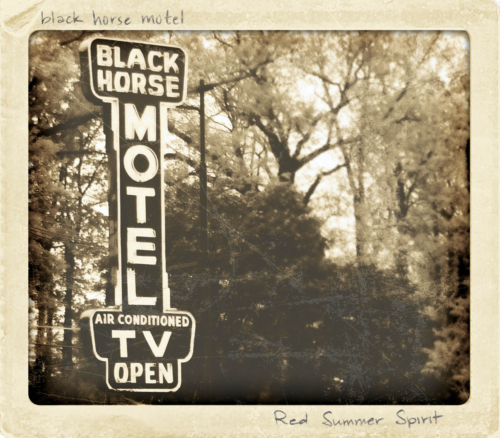
We formed on the cusp of the neo-folk movement with a banjo, mandolin, fiddle, etc. We were essentially an acoustic band with heavy folk and bluegrass influences with a little rock n' roll drums thrown in. As such, our early branding reflected things old-timey - typewriter fonts, folk art, old paper, sepia tones. Below is a sampling of the original logo and graphics I created for Black Horse Motel, as well as the 4-panel artwork from our first CD.


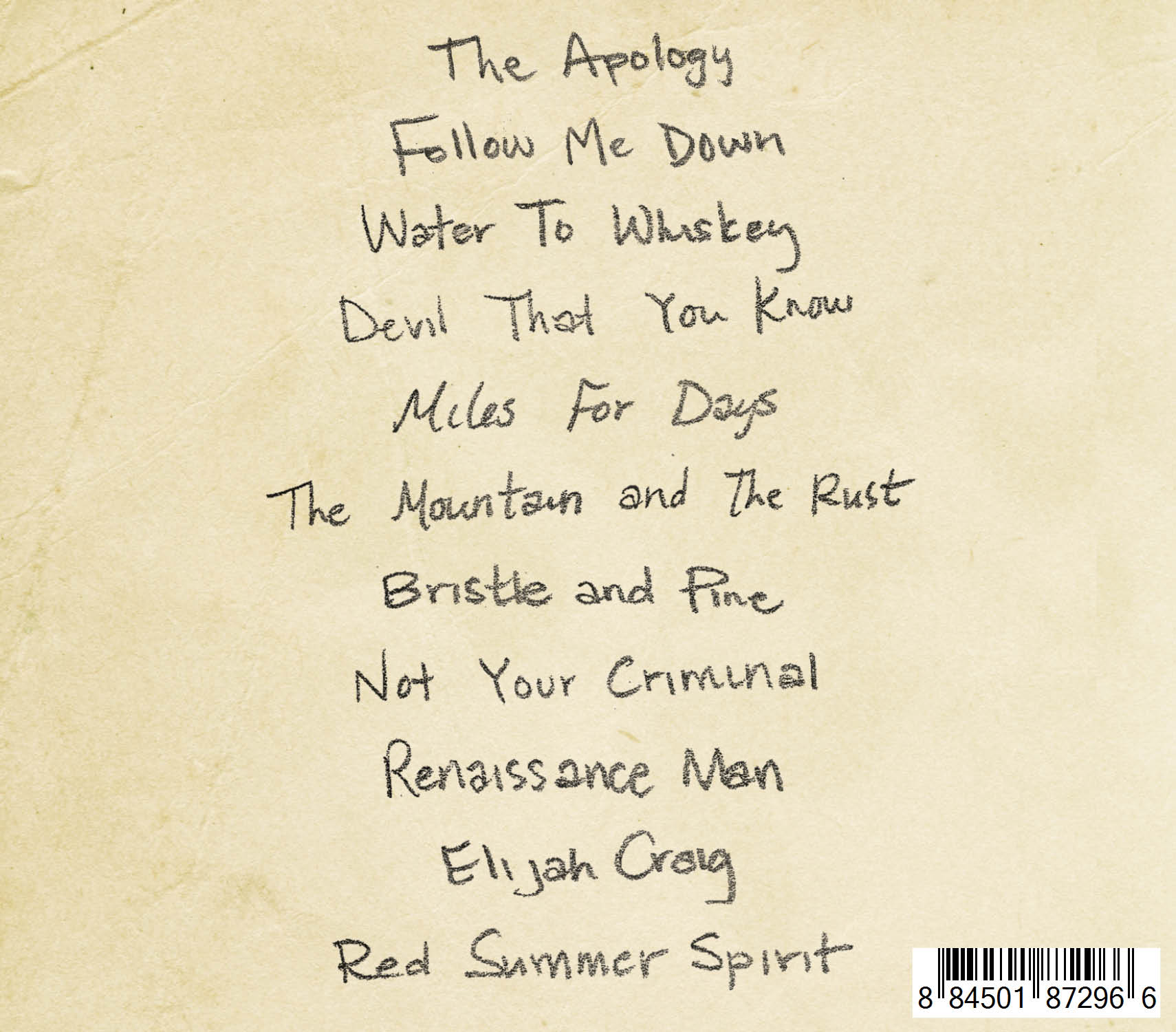
2016
Major Rebrand
By 2016, the band's lineup had changed, as had our musical direction. It was also a sadly dark and difficult year for everyone in Black Horse Motel. Naturally, this was reflected in the music we wrote for this album. It was time for a major re-branding.
For the Parable album and single artwork for Bones and Where the Money Comes From, I wanted to convey ideas of broken things, abandonment, refuse, secrets, and sadness. That is where these songs were born. But that was not where the band was staying. Therefore, it was imperative to convey ideas of rebirth, finding beauty in unexpected places, and bright colors. So we set out to find a location in Philadelphia that captured that essence.
We found it at Graffiti Pier, off I-95 in the Fishtown section of Philadelphia - a place abandoned and given new life with street art, where plants have started to reclaim the ground, where sun beams create high contrast areas of light and darkness. I also fell in love with the infinite perspective of the old railroad pilings. It perfectly conveyed how dark times can feel endless, but do eventually open to the light. I set up specific shots that I wanted for the cover with our photographer. In the end, I stitched a few of the photos together to create the cover image.
Below is a sampling of the new logo, the CD jacket artwork, and a DIY t-shirt design that we hand stenciled and spray painted.


2018
genre-bending
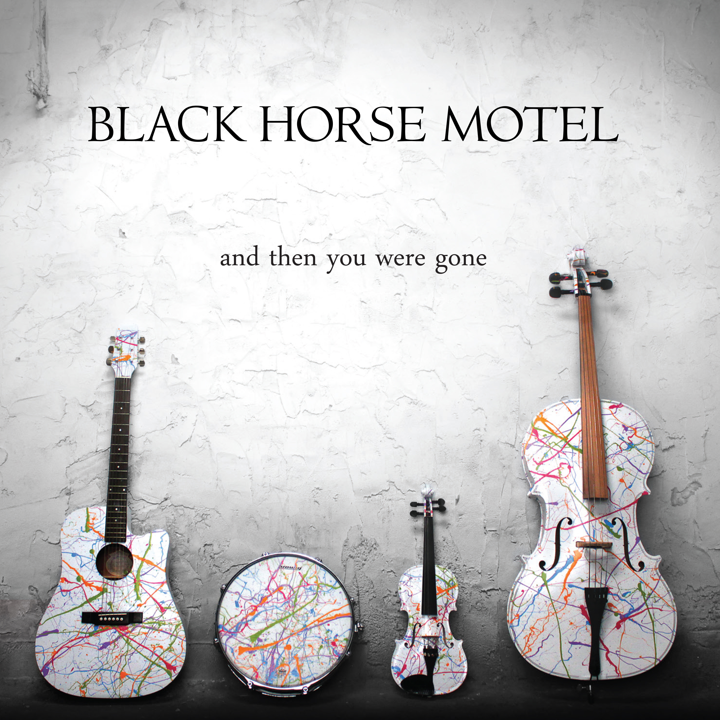
For BHM's 2018 EP, "And Then You Were Gone", I wanted to very purposefully convey an opposite visual experience when compared to the relatively dark visuals of 2017's "Parable" EP. "And Then You Were Gone" can be seen as a epilogue to "Parable". It tackles many of the same topics, but from the view of having come out on the other side of tragedy, on your own, with a clear sense of self. During the recording of this album, we realized we were no longer a folk band, but creating our own sound, which we called genre-fluid city folk - influenced by music from all directions, going in whatever direction the music takes us.
Visually, I wanted to convey light, hope, and joy, with an undercurrent of being at peace. The four of us had become something more than the sum of our parts, each a corner stone, each equal. These four basic sounds are how we created this album; they provide a medium thorough which to tell our stories, so I put them center-stage.
To create the cover, we sourced old instruments, primed them with white spray paint and then splattered each with neon paint. As luck would have it, I found the perfect wall in a friend's house, with just enough texture and contrast to add to the shot, but not distract from the subject. I worked with our photographer on lighting the instruments. My vision was high contrast with as little shadow as possible. For the back, I wanted the group to look natural and as a unit, hence the plain black shirts, but with each of our personalities showing. The final image is four separate photos from that shoot comped together, capturing the essence of each member.
Below is the CD jacket artwork and two DIY t-shirt designs that I had one color screenprinted and that we hand painted.


Curtains
ten years gone
Black Horse Motel stopped performing together in March of 2019. Regrettable as an ending is, this project gave me creative outlets through music and design and helped me grow exponentially in my own creative processes. I am truly proud of the music we made and the designs I created during the past decade with the group.